Monday, 22 October 2012

Manchester a cultural wonderland...crafty too!


Having not long returned from the sunny climbs of Manchester, yes is was sunny I promise, I felt it only fair to share my thoughts on a two great visits I made. One was to an exhibition, the other a contemporary craft fair. Now that you have heard all about the exhibition now I am compelled to speak about the fine line between the art & the craft. Both are just as appealing to me. Consumption is the answer, small numbers & editions versus the mass produced. However, most of what I saw & loved came in small numbers but was much more affordable & really worth blogging about.


Andrew Oliver's crooked tables & lamps were amazing, with more practical   abilities than you would think. This table for example held up our wine glasses just fine with a vase of flowers on there too! The recycled element is what appealed a lot too, without sounding preachy, well worth re-using old for new works well when re-furbished so professionally. 

Taupe Camomile large brooch on silver and titanium scarf.

Corrine Evans was also at the stand & I admired her jewellery & was thrilled to find out that she made it herself. My favourite by far are these wonderful titanium scarf with a brooch. No worries on the allergic reaction front with this stunning & intricate work. 


Shivani Jewellery also struck me as notable as her architecturally inspired ideas jumped out.

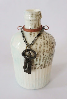
Katherine Lees designs are charming Victorian inspired objects & jewellery, notably keys are a favourite emblem.  


Ceramic artists like Zoe Lloyd also had some lovely works including this, her first drawing of her cat. Each plate is unique & the rough nature of them adds to the appeal of her aesthetic. Not easy to stack though, definitely one for the wall. The mark making she uses have a childlike charm, but are injected with a wry sense of humour. 

Then after seeing such a great show about paper we were thrilled to see Jennifer Collier's work. Her camera had been the image that had sparked an interest to go in the first place. Her other cameras are wonderful also. I love this Roliflex, especially the details she incorporates into them. 


This one Collier seems to have used an old letter. I think these would look amazing under bell jars. Prices start at £120, a snip!


Then came Katherine Richmond with her Victoriana works using threads & collage together to narrate her own Alice in Wonderland-like stories.

Constallation brooch

This work is inspirational binding both the art history & fictional ideas of the period with contemporary designs. I'm sure this is not the last I will see of her work.

Kate Kelly designs paper sculptures which are great additions to the wall as well. Her owls are especially good. I loved the squirrels as well. It really is perfect for this time of year, woodland creatures & birds are very 'this season' it seems.
Hello Sunshine print

Ruth Green Design I have come across before in London. I'm not sure what her editions are but i would love this to add to my 'orange' favourites. Her retro style here really works. The 1950's/60's feel reminds me of a lot of design on fabrics & crockery of the period.


Bekx Stephens  paper sculpture is so beautiful, the urge to touch them is insatiable too. Ruffs came to mind when I saw her work. Lots of patience & an eye for the folds no doubt. Issey Miyake would love these. 

I know this is a short blog, but it will keep you going till the next photography wonders tucked in my belt! 

Friday, 19 October 2012

You can take the girl out of Manchester...

Sarah Bridgland
Fotoeken 2012
Found German photo corner mounts, paper card, glue.

When I visited Manchester recently I was thrilled to have the chance to see the wonderful new exhibit 'The First Cut: Paper at the Cutting Edge' at Manchester Art Gallery. This fantastic show was filled with so many of my favourite things...

 Sarah Bridgland
Matemaatika 180 x 180 x 48mm, mixed media (2011)

Sarah Bridgland's work was my absolute favourite with her intricately cut 3D drawings exuding nostalgia & reminiscent of wood block prints from the 1950's. Her geometric modernity creates small worlds that make you want to shrink & wander through. Her blog is worth a look at too!

 My mum looks at Claire Brewster's work 
The Harbingers 2011 
Photo©Laura Noble

I have also mentioned my love of Claire Brewster's work before, so was thrilled to see her birds in flight across the walls of the gallery. As I made my way through the gallery it seemed to me that I wanted to take pictures of every work I saw so bought the catalogue. If you love collage I suggest you do the same it's a great publication & cheap too! The birds are cut from geological maps & set with pins onto the wall. As they flit across the white expanse the maps are broken, physically & virtually transcending the borders of geography, poetic & beautiful.  

 Su Blackwell
Wuthering Heights 2010
Handcut 3D book sculpture

Su Blackwell forms narratives from the pages of a book with magical results. Her diorama although from an adult fiction has the sense of wonderment found in fairy tales. Lit from inside the farmhouse warms the scene as well as adding to the eerie atmosphere. 

 Justine Smith
The Judge 2011
US Dollars, perspex case

Weapons are always made to look cool when artists get hold of them for political effect. Justine Smith is no exception to this. Money is after all the root of all evil as well as making the art world go around...

 Justine Smith
Inheritance 2012
Chinese 100 Yuan notes 

She infuses horror, greed & beauty with objects calling out to be handled as much as the notes that cover them. 

 Andrea Mastrovito 
Enciclopedia dei fiori da gardino 2009

This enormous installation of flowers by Andrea Mastovito in the centre of the room covered the floor as if the images on the seed packets grew themselves. Tantalisingly tactile but in her words she makes "clean but totally impersonal cuts". 


Andrea Mastrovito 
Enciclopedia dei fiori da gardino 2009


This phrase fascinated me as if the mechanical nature of the way in which she cuts the paper somehow removes it from her own hand & into the flower to become alining thing in its own right. 


Manabu Hangai
Wonder Forest 2012
Seaweed raw hemp paper pigment (Hosojuzumo), recycled material (petal, leaf, toys, brochures, flyers, ribbon, seashells, etc.)

Talking of living things, the first thing to move in this space other than the visitors is this calming work by Manbu Hangai. The branches are suspended just above the floor so as to gently move & turn.


My mum chills out in the Wonder Forest


The leaves are made from seaweed collected by local fisherman in the oyster beds in the nature reserve near Hokkaido where he lives. This particular species of seaweed hosojuzumo prevents shellfish growth, so Hangai's use of it is also environmentally friendly. As you wander through the sculpture you do feel like you are in a mediative state, everyone slows down, marvellous.


Andreas Kocks
Paperwork#1213G

Then there are the epic brushstrokes in graphite on watercolour paper by Andreas Kocks. These sweeping swirls are full of energy despite their carefully planned beginnings made on a much smaller scale. The paper looks like plastic as the graphite coating is thick. 


Andreas Kocks
Paperwork#1213G
(detail)


It reminded me of a studio I once had  in Limehouse that some artist before me had thought to coat the floor in graphite. Needless to say I did myself quite the injury (concussion actually) whilst walking across the studio with a large painting. As I fell backwards I held my arms up to protect the painting & cracked my skull instead. Explains a lot I must say.


Kara Walker
Grub for Sharks: A Concession to the Negro Populace (detail) 2004

There is little care for skulls here either. Kara Walker's paper work was truly disturbing & not for the faint hearted. There is nothing gentle about slavery, the cruelties & injustices of the slave trade are laid on bare walls in silhouetted forms of the unspeakable, unthinkable...
In a dedicated room on its own this work is difficult to be in, but powerful & moving so essential viewing. The combination of black on white works as the perfect metaphor, inverting & subverting at the same time.


My mum makes another appearance for scale purposes

Chris Kenny creates compositions of fragments of found ephemera pinned lie beetles in a natural history exhibit. 


Chris Kenny
Capella 2012
Mixed media construction with map pieces (detail) 

Taking things out of context his narratives are assembled, in this case with the graphic circular discs which pivot within their own universe like the star they are named after, the 6 brightest in fact.


Yuken Teruya
Notice-Forest (Burger King) 2009

Taking the lowly wrappings of fast food & turning them into magical places seems unlikely till you see this amazing piece. It is like a puzzle waiting to be figured out as the first thought that comes to mind is 'how does he do that?' 
  

Yuken Teruya
Notice-Forest (Burger King) 2009

Discarded remnants & reminders of globalisation feature in Yuken Teruya's practice & reflections on his homeland of Okinawa. If you think the Burger King bag is good, his treatment of 6 McDonald's bags leaves me troubled by its aesthetic appeal.


Yuken Teruya
Notice-Forest (Burger King) 2009


The irony of the deforestation due to fast food chains is direct, but sometimes a little directness is what we need.


Tuesday, 16 October 2012

Brighton Biennial & Brighton Fringe highlights...

© Laura Noble
A sunny day in Brighton this weekend was the perfect opportunity to catch up on the Biennial. We arrived as the sun was setting on Saturday evening. It was  enough to see the sea after the fast paced day we had had in London prior to this after a big night the night before celebrating my life on earth for one more year! As we had one day to see as much as possible I have decided to post on my personal highlights as there are far too many shows to cover in all. 
© Laura Noble
After a fish n chips as is the tradition our Saturday night came to a close with a view of the pier.
One of the first which must be mentioned is 'So The Wind Won't Blow It All Away' by the AgNO8 collective shown at Gallery 40. With a selection of 8 photographer's to choose from there is something for everyone, from the deeply moving abstract images of the interiors of cremator furnaces with Maeve Berry's 'Incandescence' series to the abstractions caused by interfering with a discarded negative from his family's collection by Sam Taylor in 'Family Obscured' which is displayed as a 5m long negative in a double sided lightbox.  
© Edmund Clark
Edmund Clark's 'Control Order House' at The University of Brighton Gallery is definitely worthy of a mention, due to the access for the first time by a photographer to the house in which someone placed under a control order under suspicion of terrorism. His photographs were carefully scrutinised by the authorities to ensure the anonymity of the location. The resulting images speak volumes through the banal surroundings, both absent of any character human or otherwise. Although you would not necessarily want to have these on your wall at home, they are revealing. Perhaps placing them in a fine art context will give them more longevity than an image in a newspaper which is soon forgotten.
© Omer Fast
Also at the University of Brighton Gallery was a film which once seen is hard to forget. With high production values, slick filming & a seamless 30 minute loop, Omer Fast's 'Five Thousand Feet Is The Best' was riveting. In a pitch dark room (so much so it took me a long time to figure out how to get across the room to sit down without falling over something or someone) a former drone operator talks of his experience flying unmanned planes from a control base in Vegas. His targets, both the militia & civilians in Afghanistan & Pakistan may be far away but the effects of his actions can be felt in his voice. Alongside this interspersing with the narration & blurred visual of the operator are 2 dramatisations, the 1st of a man in a motel played by Denis O' Hare (better known by most as Russell Edgington in True Blood) & a tense tale of a family going for a day trip with tragic consequences. 
© Omer Fast
It has spectacular arial shots of Las Vegas that invoke awe but also act as a sombre reminder of the optimum height & firing position for the drone as suggested in the title. If you can see this film. 

Then in the same vein, Trevor Paglen's excellent show at Lighthouse 'Geographies of Seeing' exploring the unseen pictured the astral movements of spacecraft as tracked by amateur satellite watchers that don't officially exist & covert bases, top-secret government sites with a super-strength telescope he adapted to photograph sites up to 65 miles away. 
The images themselves were vague & beautiful. Without the captions they are as anonymous as they are intended to be by the authorities. 
The place was very busy & rightly so. Go & see for yourself.
© Louise Maher
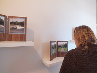
'Origins of Encounter' at Phoenix Brighton included 3 photographer's work exploring site specific notions of place. The presentation of Louise Maher's work on wooden tablets showing 'Roadside Mariolatry'. Each photograph of the same location photographed 6 years apart & engraved with the year (2006 - 2012) looks at roadside shrines or grottos in Ireland. I would have preferred the prints to have been c-types as the ink jets looked less precious than the tablets themselves, which were crafted so beautifully.  
 This image shows the intimate scale of the work, on shelves, lovely curation.
The Shadow Dial Studies II - VI by Joan Alexander also worked beautifully in the space. Her delicate projection of a medium format slide worked well. I wish there had been room for more as one wasn't working at the time, so we had to be content with a lone image from this gorgeous vintage projector. 
We did see more, but with stomachs rumbling we headed to Bills, the best place in town for great affordable food. 
Here is the motley crew clockwise from left: Photographer Lisa Creagh, Photographer & picture editor Elizabeth Orcutt, commercial photographer Stefan Ebelewicz, the delectable (& well known to all my readers) photographer Gabrielle Brooks, serial blogger & my long suffering boyfriend Mat Barnett.

And what a meal it was, I would strongly recommend the Eton Mess, yum!


Friday, 5 October 2012

AOP Awards 2012


Wendy Carrig
Non Comissioned Portrait Single
Best In Category
Last night was a blast, with the AOP Awards 2012 full of great work at the P3 Gallery with a vast array of work on display. As a judge I had several categories to look at with my fellow judges Chris Steele-Perkins Bel January. There are so many works to mention but I have chosen a few to highlight which I thought were particularly interesting.

The first is Wendy Carrig, who's emotive portraits had a softness of touch that renders her sitters in a quiet light, dreamy almost. Her style reminded me of Vee Speers without the addition of colour, with Carrig's standing portraits, simple yet effective & reflective soft toned models.

Jim Naughten
Hereros
Non-Comissioned Portrait single
JimNaughten's series Hereros were not unfamiliar to me & I was pleased to see them again in the flesh. They capture the proud traditions of this Namibian tribe, whose turbulent history is present in the costume of several of his subjects.
© Jim Naughten
Hereros
2012
Since the war which broke out in 1904 where 80% of the tribe were killed by the German colonisers the tribe would take to wearing the uniform of those they killed in battle. THe combination of this tradition & straggly Vistorian dress for the women of the Herero make for fascinating viewing. Although Naughten does not try to fully represent the culture of the Herero, he does encompass their strength of character against the harsh landscape of the land they live. The horn-like headdresses made me think of the hammerhead shark, buffering against oncoming attack. This coupled with bright patterns & colour pop out of the print like an inverted silhouette.
© Spiros Politis
Men With Beards series
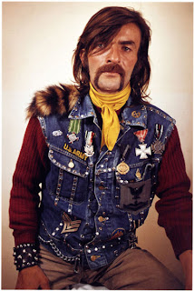
Spiros Politis' Men With Beards series is very 'of the moment' with beards making a comeback as hipsters flaunt their follicles for all to see. This image in particular however, reminded me of the work of Karlheinz Weinberger in the 1960's amongst which his portraits of Swiss biker gangs included many a hairy chap as you can see here. 
© Karlheinz Weinberger
Another work that was not in my category to view as a judge which I saw last night was the 'Comisssioned Design Single'. What part of this image is 'design' I would be glad to be informed  of (have no idea how this reated to design, but there was no info on this with the photograph) was Dylan Collard's portrait of a woman behind glass stippled with water. 
©Dylan Collard
It had a very filmic quality to it, which had a feeling of expectancy, a story waiting to unfold....
So with that, my story must end here as I have to get off the train very soon. Please don't forget to leave a comment if you can, I'm always keen to hear your thoughts.