Showing posts with label Amsterdam. Show all posts

Wednesday, 16 October 2013

Post Unseen & beyond...


Our beauteous stand at Unseen with 


Well back in Blighty & a wonderful new show to boot. 

Deborah Baker's show opened to much fanfare last week, if you haven't had time to visit please drop in to see it. Her talk next week (Tues 22 Oct 18.30 - 20.00) is not to be missed, and another Salon session too (only one for this show I'm afraid folks) see all the details here.  

The audience begins young these days

Her talk will include an exclusive glimpse into the development of both her photographs in conjunction with the creation of her stunning woodland garden. Places are filling fast so book your place to avoid disappointment on the night. Doors close at 18.20 so don't be late!

So Unseen Photo Fair, what a great week. After lectures the week before at Foam Museum on collecting photography I was happy to bump into most if not all of the attendee's at the fair. This was a wonderful way to feel right at home. My assistants Emily & Katherine were invaluable & kept me going. Katherine will be blogging about the most amazing experience I had at the fair, namely having 2 tintype portraits done by the wonderful people at the Tintype Studio - so I won't say too much here, keep an eye here for her post!


For the time being here is a great video of one of mine developing! It was so exciting & really interesting as it is a mirror image, making me think about doing a self portrait as I haven't for many years - over a decade in fact. The image was easier for me to look at because of this, but odd for other people...

Here I come...ready or not

Then there was also the JR fun after a wonderful meal with fellow gallery directors & collectors. I had seen a similar setup in Arles but had no time to partake, so I seized upon the opportunity. Several friends did as well. 

As you can see I was quite pleased about it


Sadly Katherine's pic was scuffed by the time I had chance to see it, but her 'blue steel' look is superb!


Then I spotted us on the cover of a Dutch newspaper! 


Here is the floor plastered with our mugs. 


Now another wonderful exhibit that is not to be missed in Amsterdam is at the Stadsarchief Amsterdam which is on till 5 Jan 2014. The building is amongst my favourite in the city, with it's wonderful art deco facade. I shall be reviewing the book that accompanies it also. It was a wonderful surprise to come across it & one of the best shows I have seen in a long time. You can also choose the cover of your catalogue here


A.Jager 
c. 1866

An exhibit on the ground floor of stereo images, fascinating. I have a stereo camera myself & really enjoy seeing the results, stepping back into a place via the 3D image. These pictures although taken long ago showed how little has changed in this wondrous city.


 Going through 40,000 glass negatives - to find this selection - the curator has shown dedication beyond all imaginings with a remarkable show of works by Jacob Merkelbach's studio.


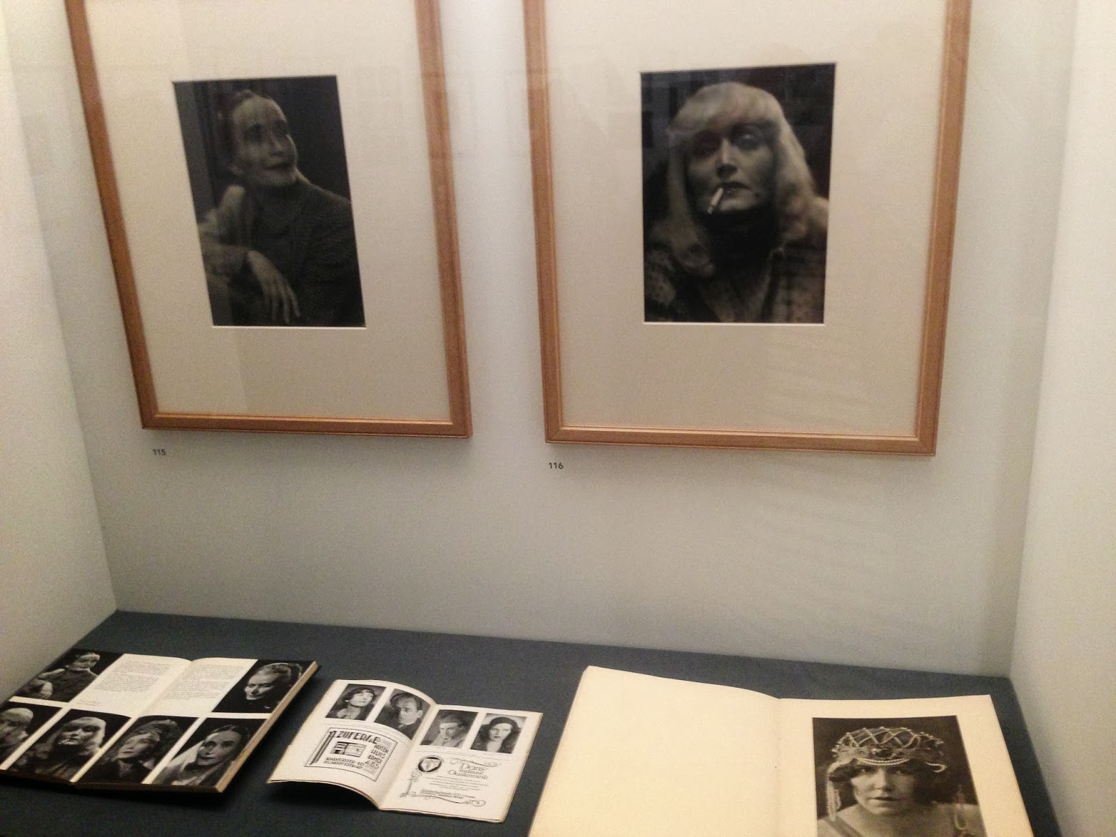
One of the studio's specialities was portraits for actors to display their talents. Here we can see one actor with a whole plethora of 'looks' with cleverly styled hair & makeup which allowed her to transform from one character to another. 


Examples of the films that the actors were in placed underneath the photos really is a great way to see a moving image as well as a still one.  


Again, here is the transformation from a black & white photo to a theatre poster. 


Some of the photo's were just plain stylish...


Curator & Assistant Conservator


Then the building itself with the vault below is fantastic. 


Some of them have also been used as small gallery spaces.


Needless to say I had a marvellous time with many museum visits in between. 

Even the parks have photo's in them.

More soon...


Sunday, 15 September 2013

Autumn is upon us...curating the Vole & other spaces...

Helén Petersen's work awaits it fate...

Hello dear reader, with summer well & truly over my favourite season has almost begun. Autumn I am told in the Northern hemisphere officially begins on September 22nd till December 20th! With that in mind the art calendar also begins in earnest with so much to see we will barely know where to start.

Unseen opening 2012

As you may or may not know L A Noble Gallery is in between exhibitions & off to Unseen Photo Fair in Amsterdam 26 - 29 September. I am off to Foam Museum to give some collecting lectures on Tues/Wed evening, so before I head out thought it only fair to post beforehand.


Phillip Wülfing's domestic image in a warm wooden
 frame compliments the space beautifully

A new show is always an exciting time as the preparation leading up to it finally becomes a reality. It's a bit like looking forward to a holiday without the beach bit.  In this case the change of venue provided a new challenge from a curatorial point of view, which I relish. Curating the same space is good, but the creative solutions you have find to make the most of a new space is all the more satisfying when they work. 

Katherine & Emily measure

In the current Maybe A Vole space with its grey walls allows the work to ‘pop’ as the contrast pushes the wall back & the images forward. We are so used to white walls in art galleries & often by altering the status quo an audience can receive the work differently. This refreshing change of backdrop, with warm toned wooden furniture also has the effect of perceiving the pictures in a more domestic setting. Measuring the space is the first essential step to establish what will fit comfortably in the space. 

 Lanscape/portrait mix it up & measure

With 31 works & 15 artists to display the first task was to look at the sizes  & see which were the largest works – where they would be best placed in order to utilize there size within the whole exhibit. 

So Helén's work goes up in 
the middle of the left wall 

The larger works of course are apt to stand out, so hanging the largest works first sets up the balance for the rest of the display. 
Then the scale can be played with...

Anne Leigniel's work on the right wall

By hanging the smallest works at the furthest point emphasises the depth of the room even more - encouraging the viewer to come further into the room and stand closer to the smaller work in order to look at it at its optimum distance. 

Make it bold

The height can also be played with, by stacking one work above another.

Sketch it out

As a visual person I find that a combination of scaled drawings & placing the works themselves against the wall to see how well they fit in the space is the best way to realise your vision. Planning a wall can take a lot of measuring, but well worth it. 


The spaces in between works if too large or small can ruin the flow of the exhibition. When done right you barely notice the curation. Bad curation stands out a mile. 


I think back over the best shows I've seen & invariably the best curated shows not only make a greater impact but also encourage you to look at each & every work. 

Variety adds to the interest of the work 
playing with horizontal & vertical lines

If placed badly your interest can be lost or works missed all together. I have seen works obstructed by pillars, other objects like plinth's in the way so that I couldn't get close enough to see the detail of a picture on display behind it. 

A painting is not painted at this angle so why hang it so?

A little trick if a picture has to be hung from a rail - to stop it hanging forward, put a slice of cork behind it so it doesn't lean forward. Alter the width of the cork for the deisred effect. The weight of the picture will hold it place. The cork doesn't slip. You can buy these things but  just save your corks & voila! A painting is not painted at this angle so why hang it so?

Already the depth of the space is accentuated by the size
 of the works in relation to the space

It's always good to 'walk the show' as if you are a visitor. Walk in & go left, right, clockwise, anti-clockwise to see if anything is lost or not given the space it deserves. The size of a space needn't be a negative if the show is well thought through. 


My most recent planning has been off site for Unseen. To plan the walls each work was printed to scale (nothing fancy) with a wall made to scale out of paper. I prefer to use 10cm as 1 meter as it's a nice size to fit on a table. Then with the images cut out they can be moved around & visualised pre-hang. 

Of course there may be minor changes on the day, but this prep is really invaluable, especially for a fair when there is a limit to the time you may have to hang your walls. Last year we had the whole space hung in 3 & 1/2 hours! Not bad. 

Then presentation, clean clear labels - or in the case of the Summer Salon - numbers to label the works in a more subtle way giving the works more space on the wall. With photography I am dismayed when labels do not give all the appropriate info. I went to a very large exhibit recently which did not disclose either the type of print or if it were a vintage, modern or exhibition print. Some looked like they were there for context & not originals at all. This in my opinion is unforgivable. 

If the info isn't displayed with the work it needs to be available to the audience wether it is for sale or not. I always include the following info if possible, either on the label or available if asked for so as not to overload a label with too much text: I've put the bare minimum in bold.

Name of artist/photographer
Title of work: Either italicised or 'like this'
Date taken/made
Date printed/made
Edition - 1 of 5 or 1/5 or #2 from an edition of 5 for example
Type of print/medium: Archival inkjet print on ***paper / C-type etc... NEVER giclée (see previous rants for why)
Price: Either + VAT / excluding VAT / inclusive price outright

Occasionally the series may be mentioned or the other sizes available - but usually this is obvious or is on other hand-out materials/leaflets.  

It's the finishing touches that make a space pleasant to be in, wether that be a bunch of flowers on the desk or comfortable seating & space to move around in. 
Model planning

The next show at L A Noble Gallery is In Paradiso by the wonderful Deborah Baker & in order to work out the way in which her large & small works would be displayed a model of the whole space was made. We even have furniture to really get a sense of scale. (Thanks Emily) 


The hang will be dramatic, I can barely wait! Watch this space for more pics. In the meantime see the website, Facebook, Twitter or the gallery Twitter for updates...see you at Maybe A Vole or in Amsterdam soon!


Tuesday, 2 October 2012

Handbags at dawn!

Handcrafted is always worth the time & effort.
Whenever I visit a new city I try & see something unexpected, so whilst in Amsterdam I went to the Museum of Bags & Purses with Gabrielle. It seemed only fitting to have a bit of a girly day before the fair. It turned out to be a fascinating gaze into the past from a completely different angle. 
The museum was very informative with wonderful displays & examples of bags & purses appearing in other art forms as well.
Seeing the delicate hand finished details of many of the bags & the accessories that went with them reminded me of the beauty of a well made, hand crafted object can really delight the senses.
If you could see how small these lace flowers were you would be amazed. The care taken to make them would take patience & concentration that would be nigh impossible to find nowadays I wager.
The top of a handbag could be a thing of wonder, with so many themes here. I must say the foxes were my favourite. 

I went to an exhibition at The Hayward Gallery many years ago of things made by people in asylums at the turn of the century mainly.  One work was by a woman who  had embroidered her handwriting obsessively. At the time I was mesmerised. There is something very pleasing about beautiful handwriting & even moreso when stitched so carefully. 

Of course a stark reminder & well chosen display with this Olympic clutch. I saw a lot of plastic naff trinkets on sale throughout the Olympics, but never something as groovy as this, with every bead stitched on by hand. This woven beaded bag is from Germany 1928, quite eerie when I saw the date. 
We started at the top of the stairs going back in time & working our way down this lovely staircase. 
More beautiful handwriting, nicely finished with stamp & postmark. As an avid letter writer (yes I write about 3 letters a week to friends & family with my favourite Lamy fountain pen) I think this clutch would suit me fine. However, for those of you who know me, I would never fit anything into such a small purse, I'm more of a Mary Poppins lady where bags are concerned. (Not through choice I hasten to add)
Then the fans, only two of them but from the 1930's, an era  adore for its style, depicting how the other half lives...

Even the ceiling was utilised in one room, with these ghostly bags suspended above us, lit to dramatic effect. It is curation like this that inspires...
Although there were a couple of bags with birds on them I thought the arrangement of these feathers was spectacular. What was astonishing how so many of the bags could be used today, without the least hint of being out of fashion. Why is this?
Once again the care taken to vary the displays really made for a great visit. Each room had a different feel, taking you forward in time. By the time we got to the turn of the century the nostalgia worked into this arrangement with the backdrop of the train station left the bags & their contents to create the hustle & bustle of the platform during a busy day. By putting lots into one space you are encouraged to take longer to try & catch every detail We didn't want to miss a thing. 

Even the plastic ones became jewels lit from below like little wedding cakes. How practical a bag is is not the issue, but how amazing it looks!


Sadly this camera bag (see what I did there) was in a very dark case. Unlike many of the visitors I refused to give in & use my flash so this is as good as it got. (Massive pet peeve when people do this as it is a sure fire way to help things fade quicker) I think it's a snuff box.
Then came the cute & creative stuff. At first I thought, aaah a tea party, but no these mice are playing poker!

Practical? No. Fabulous? YES!
Like a big jelly really...
Now for the clever stuff by arty farty types, which I of course loved. Above is perhaps my favourite bag in the whole place. The simple rendering of an amazing idea had me dreaming of a whole range like this with wire shapes & a draw string pochette in the centre. Can you imagine a briefcase, satchel, rucksack, shoulder bag....amazing!
The further deconstruction here was great too, but not a great way to hide your purse. 
Not a favourite, but thought the photo was nice, despite being out of fashion (finally) the cupcake.
If you haven't had your 5 a day head to the handbag museum! There was something quite disturbing about this giant veg, but did make us smile.
Utilising other objects, to have other uses ( I am currently seen wearing a bracelet that used to be a steel rule & an earring that was once a sugar tong) like this swimming cap. 
Animals are always favourite decorative themes, but this cat looked very manky & made us laugh A LOT!
Then the dog had us in stitches with his hilarious expression.

The museum cat made an appearance as we stopped our tour for a glass of rosé to keep things civilised. 
Next to us was another lovely object, this time a ceramic lady in a bell jar, whats not to like.

The rosé did not last very long. Happy days...