Tuesday 5 November 2013

Deborah Baker speaks!

Ariel View of the woodland garden
The block with planting 

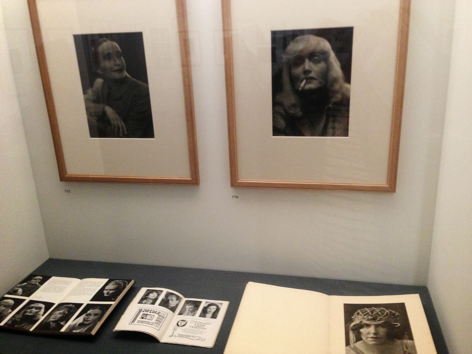
On the 22nd of October when Deborah Baker came to talk about her work & the progression towards her current practice alongside images of the garden which has inspired the series 'In Paradiso' which is currently on display at L A Noble Gallery.

Hearing the artist describe their experiences is always eye opening for me as I have a less formal relationship & discuss their work in the present tense with them most of the time & look forward rather than back. What was extraordinary was the way in which coupled with her words we could see the way in which her work has altered over a long period from black & white, to figurative to a more fractured aesthetic. Just like her woodland garden her work has been 'cultivated' over many years. She approaches each plant individually looking at texture & form then harmonises it with another - balancing the colour & light through many layers.

Light is the key to her work, using images taken at the same time day & same the time of year so that the tones & colours compliment each other appearing more natural as each image is layered & edited. Editing is the key to her work, with many images paired back afterwards to give the composition the perfect balance of positive & negative space. 

Prunusky - seeing the layers develop, the complexity becomes apparent
©Deborah Baker 


When I first saw Deborah's work this is what struck me. When learning to draw or paint the use of negative space is essential to show the importance relationships between objects to be as important as the objects when composing a still life for example. Working with shapes & forms coupled with light & shade so much can alter as a work progresses. Without these considerations an image can lack depth or visual interest. Cutting away is often as key to an image as adding something to it. Baker understands this. Her intricate photographs are more akin to lacework than collage, the gaps revealing the forms rather than the other way around. 

©Deborah Baker

Looking back at Baker's work prior to In Paradiso you can see how her use of figurative elements within space transition throughout her work towards her current practice. In the series  Ghosts Baker combines her own photography with snapshots of past & present generations of her family. In the example above she coloured the figures from a black & white photograph & added architecture & context. By paying careful attention to detail - colour, form, tonal range - without overtly making the image completely convincing as a straight photograph she creates an ethereal aesthetic. In doing so Baker literally breathes life into past generations, allowing them to interact with present ones. Plants, trees & architecture alongside these relatives provide the perfect metaphor for the cycle of growth,  renewal, decay & death. So began the connection with plants & the metamorphosis of them within her photography...
©Deborah Baker

The immediate landscape around Deborah provided great comfort & solace when her late brother was diagnosed with cancer in 2007. The two come together here in her photographs as the figures become more ghost-like as layered foliage entwines with the past, present & future. Baker's own family history narrates whilst seeping into the collective unconscious of her viewers own family memories...

In printmaking after running a plate through a press it is usual to print a 'ghost' by repeating to press the plate a second or third time. The ghost is a much fainter version of the image on the plate, this is also used to layer one print on top of another. Baker's 'ghost' may be more literal, but they also have a  connection to the physical reference of the original object - in her case a photograph - as well as ethereal notions of the afterlife.

Her garden was the perfect space to grieve & contemplate. Our need for a record of loved ones helps us to remember them & leave an imprint in the physical world as well as our inner thoughts. Baker's images do this. As In Paradiso developed as the garden grew she recorded the growth of her plants, shrubs & trees just as one would with children. As they grew they changed & in recording this transition the material available to 'layer' her imagery is limitless as seasons come & go & the maturity of the garden alters continuously.  


 Japanese Kanji for Ma (interval or space)

Negative space in Japanese culture is known as 'ma' the pause in between other structures is seen as being just as important. The hollow in a tree can be a space of spiritual contemplation, & as I have mentioned before in the book In Praise of Shadows the weight of such spaces can also accentuate the light & solid forms that surround us. The Kanji itself illustrates the aesthetic harmony of space beautifully. 

When planting a garden negative space is an optimum consideration as the seasons come & go some plants die back & others flourish or remain in altered forms. Pre-supposing where these spaces will be & what can fill or be revealed through these spaces can dramatically change ones experience & enjoyment of the garden. Baker constructs er images just as she does her own land, with care & forethought. 


Raouliexigu ©Deborah Baker

When I saw Raouliexigu for the first time my instant reaction was of a place I knew in my minds eye, a painting by Seurat called Study for A Sunday on La Grande Jatte. This pointillist masterpiece relies on the spaces in between the figures to accentuate the rigidity & placement of them. Each figure could as well be a tree & the grass the light that passes in between. Strangely, the fractured detail creates a more solid & almost heavy feel to the work as if the people within it are rooted to the spot never to move again, as if finding the perfect place in which they should always be. 

Study for A Sunday on La Grande Jatte, 1884
Georges Seurat (French, 1859–1891) Oil on canvas

Just so you can see the red border is part of the painting...


The painting bound in its frame alters the way in which we view it - despite the red edges of the image which heightens the intensity of the reds (warm tones) in the work against the green & purple (cool tones). Branches, leaves, shadows & flowers all perform the same spell upon the eye in a more subliminal way in Deborah Baker's work. By leaving the photographs 'frameless' (they are mounted on aluminium, with perspex face mounting) the eye s allowed to extend beyond the edge of the image thus integrating it into the environment on a more organic level. I am really enjoying watching audiences come into the gallery & instantly relaxing when they look at the work. Shoulders drop, expressions soften, the magic takes hold. You must see them for yourself to see if you agree with me.


In Paradiso by Deborah Baker is on at L A Noble Gallery till 6pm Saturday November 16 - don't miss it. More work will be displayed next Autumn Sept - November at The William Morris Gallery (Museum of the Year 2013) . It is a long time to wait. I am sure there will be new images by then to compare with the ones currently on display, so don't miss it! 


Wednesday 16 October 2013

Post Unseen & beyond...


Our beauteous stand at Unseen with 


Well back in Blighty & a wonderful new show to boot. 

Deborah Baker's show opened to much fanfare last week, if you haven't had time to visit please drop in to see it. Her talk next week (Tues 22 Oct 18.30 - 20.00) is not to be missed, and another Salon session too (only one for this show I'm afraid folks) see all the details here.  

The audience begins young these days

Her talk will include an exclusive glimpse into the development of both her photographs in conjunction with the creation of her stunning woodland garden. Places are filling fast so book your place to avoid disappointment on the night. Doors close at 18.20 so don't be late!

So Unseen Photo Fair, what a great week. After lectures the week before at Foam Museum on collecting photography I was happy to bump into most if not all of the attendee's at the fair. This was a wonderful way to feel right at home. My assistants Emily & Katherine were invaluable & kept me going. Katherine will be blogging about the most amazing experience I had at the fair, namely having 2 tintype portraits done by the wonderful people at the Tintype Studio - so I won't say too much here, keep an eye here for her post!


For the time being here is a great video of one of mine developing! It was so exciting & really interesting as it is a mirror image, making me think about doing a self portrait as I haven't for many years - over a decade in fact. The image was easier for me to look at because of this, but odd for other people...

Here I come...ready or not

Then there was also the JR fun after a wonderful meal with fellow gallery directors & collectors. I had seen a similar setup in Arles but had no time to partake, so I seized upon the opportunity. Several friends did as well. 

As you can see I was quite pleased about it


Sadly Katherine's pic was scuffed by the time I had chance to see it, but her 'blue steel' look is superb!


Then I spotted us on the cover of a Dutch newspaper! 


Here is the floor plastered with our mugs. 


Now another wonderful exhibit that is not to be missed in Amsterdam is at the Stadsarchief Amsterdam which is on till 5 Jan 2014. The building is amongst my favourite in the city, with it's wonderful art deco facade. I shall be reviewing the book that accompanies it also. It was a wonderful surprise to come across it & one of the best shows I have seen in a long time. You can also choose the cover of your catalogue here


A.Jager 
c. 1866

An exhibit on the ground floor of stereo images, fascinating. I have a stereo camera myself & really enjoy seeing the results, stepping back into a place via the 3D image. These pictures although taken long ago showed how little has changed in this wondrous city.


 Going through 40,000 glass negatives - to find this selection - the curator has shown dedication beyond all imaginings with a remarkable show of works by Jacob Merkelbach's studio.


One of the studio's specialities was portraits for actors to display their talents. Here we can see one actor with a whole plethora of 'looks' with cleverly styled hair & makeup which allowed her to transform from one character to another. 


Examples of the films that the actors were in placed underneath the photos really is a great way to see a moving image as well as a still one.  


Again, here is the transformation from a black & white photo to a theatre poster. 


Some of the photo's were just plain stylish...


Curator & Assistant Conservator


Then the building itself with the vault below is fantastic. 


Some of them have also been used as small gallery spaces.


Needless to say I had a marvellous time with many museum visits in between. 

Even the parks have photo's in them.

More soon...


Sunday 15 September 2013

Autumn is upon us...curating the Vole & other spaces...

Helén Petersen's work awaits it fate...

Hello dear reader, with summer well & truly over my favourite season has almost begun. Autumn I am told in the Northern hemisphere officially begins on September 22nd till December 20th! With that in mind the art calendar also begins in earnest with so much to see we will barely know where to start.

Unseen opening 2012

As you may or may not know L A Noble Gallery is in between exhibitions & off to Unseen Photo Fair in Amsterdam 26 - 29 September. I am off to Foam Museum to give some collecting lectures on Tues/Wed evening, so before I head out thought it only fair to post beforehand.


Phillip Wülfing's domestic image in a warm wooden
 frame compliments the space beautifully

A new show is always an exciting time as the preparation leading up to it finally becomes a reality. It's a bit like looking forward to a holiday without the beach bit.  In this case the change of venue provided a new challenge from a curatorial point of view, which I relish. Curating the same space is good, but the creative solutions you have find to make the most of a new space is all the more satisfying when they work. 

Katherine & Emily measure

In the current Maybe A Vole space with its grey walls allows the work to ‘pop’ as the contrast pushes the wall back & the images forward. We are so used to white walls in art galleries & often by altering the status quo an audience can receive the work differently. This refreshing change of backdrop, with warm toned wooden furniture also has the effect of perceiving the pictures in a more domestic setting. Measuring the space is the first essential step to establish what will fit comfortably in the space. 

 Lanscape/portrait mix it up & measure

With 31 works & 15 artists to display the first task was to look at the sizes  & see which were the largest works – where they would be best placed in order to utilize there size within the whole exhibit. 

So Helén's work goes up in 
the middle of the left wall 

The larger works of course are apt to stand out, so hanging the largest works first sets up the balance for the rest of the display. 
Then the scale can be played with...

Anne Leigniel's work on the right wall

By hanging the smallest works at the furthest point emphasises the depth of the room even more - encouraging the viewer to come further into the room and stand closer to the smaller work in order to look at it at its optimum distance. 

Make it bold

The height can also be played with, by stacking one work above another.

Sketch it out

As a visual person I find that a combination of scaled drawings & placing the works themselves against the wall to see how well they fit in the space is the best way to realise your vision. Planning a wall can take a lot of measuring, but well worth it. 


The spaces in between works if too large or small can ruin the flow of the exhibition. When done right you barely notice the curation. Bad curation stands out a mile. 


I think back over the best shows I've seen & invariably the best curated shows not only make a greater impact but also encourage you to look at each & every work. 

Variety adds to the interest of the work 
playing with horizontal & vertical lines

If placed badly your interest can be lost or works missed all together. I have seen works obstructed by pillars, other objects like plinth's in the way so that I couldn't get close enough to see the detail of a picture on display behind it. 

A painting is not painted at this angle so why hang it so?

A little trick if a picture has to be hung from a rail - to stop it hanging forward, put a slice of cork behind it so it doesn't lean forward. Alter the width of the cork for the deisred effect. The weight of the picture will hold it place. The cork doesn't slip. You can buy these things but  just save your corks & voila! A painting is not painted at this angle so why hang it so?

Already the depth of the space is accentuated by the size
 of the works in relation to the space

It's always good to 'walk the show' as if you are a visitor. Walk in & go left, right, clockwise, anti-clockwise to see if anything is lost or not given the space it deserves. The size of a space needn't be a negative if the show is well thought through. 


My most recent planning has been off site for Unseen. To plan the walls each work was printed to scale (nothing fancy) with a wall made to scale out of paper. I prefer to use 10cm as 1 meter as it's a nice size to fit on a table. Then with the images cut out they can be moved around & visualised pre-hang. 

Of course there may be minor changes on the day, but this prep is really invaluable, especially for a fair when there is a limit to the time you may have to hang your walls. Last year we had the whole space hung in 3 & 1/2 hours! Not bad. 

Then presentation, clean clear labels - or in the case of the Summer Salon - numbers to label the works in a more subtle way giving the works more space on the wall. With photography I am dismayed when labels do not give all the appropriate info. I went to a very large exhibit recently which did not disclose either the type of print or if it were a vintage, modern or exhibition print. Some looked like they were there for context & not originals at all. This in my opinion is unforgivable. 

If the info isn't displayed with the work it needs to be available to the audience wether it is for sale or not. I always include the following info if possible, either on the label or available if asked for so as not to overload a label with too much text: I've put the bare minimum in bold.

Name of artist/photographer
Title of work: Either italicised or 'like this'
Date taken/made
Date printed/made
Edition - 1 of 5 or 1/5 or #2 from an edition of 5 for example
Type of print/medium: Archival inkjet print on ***paper / C-type etc... NEVER giclée (see previous rants for why)
Price: Either + VAT / excluding VAT / inclusive price outright

Occasionally the series may be mentioned or the other sizes available - but usually this is obvious or is on other hand-out materials/leaflets.  

It's the finishing touches that make a space pleasant to be in, wether that be a bunch of flowers on the desk or comfortable seating & space to move around in. 
Model planning

The next show at L A Noble Gallery is In Paradiso by the wonderful Deborah Baker & in order to work out the way in which her large & small works would be displayed a model of the whole space was made. We even have furniture to really get a sense of scale. (Thanks Emily) 


The hang will be dramatic, I can barely wait! Watch this space for more pics. In the meantime see the website, Facebook, Twitter or the gallery Twitter for updates...see you at Maybe A Vole or in Amsterdam soon!


Friday 6 September 2013

3,2,1 & they're gone! 1 day left, 2 days left & 3 days left, catch these while you can!


I have planned your schedule, so relax sit back & read the instructions below for a perfect photographic trio to tantalise your eyeballs over the next 3 days!

1 DAY LEFT...

L A Noble Gallery : 'Summer Salon'

Venue: Maybe A Vole, 51King Henry's Walk, London, N1 4NH

So my dear readers, it's your last chance to see the amazing 'Summer Salon' at L A Noble Gallery, featuring 31 photographic works for your enjoyment!


Here is one of the very talented artists Kate Owens whose new works are exquisite & all unique. Her detailed drawings on each image are so delicate it takes time to distinguish the printed ink from the applied ink. Measuring 25cm square each framed they are the smallest works in the show - great things come in small packages! 


Here discussing Chris's work...pre-hang.From left to right, the inimitable Robert D. Phillips, with the fabulous Chris Steele Perkins & mighty Robert Clayton


Here is a much better picture of Robert Clayton with his work from the 'Lion Farm Estate' series. Watch this space for more about the series in forthcoming posts...


It is such a pleasure to walk into this space, I shall miss the show as I do every one I curate. 

From left to right works by Kate Owens, Philipp Wülfing, Chris Steele Perkins, Anne Leigniel & Herb Schmitz


This stunning image by Philipp Wülfing is from his extraordinary series, 'Alzheimer's' in which he recreated still life's of things which his late mother did during the latter stages of the illness which we still have no cure. In this case when a gift of roses was received she wrapped some so that they 'would not get broken'. This touching surreal scene reveals much about the confusion of the illness as it does his own tender memories of his mother. See the rest of the series here


From left to right: Helén Petersen: Truly stunning work which when you realise that she hand prints these silver gelatin wonders. This large work took a full day in her darkroom & well worth it! 

Colin Coutts' 'Disruptus Digitalis' series literally display the stolen, chewed gloves that have been deposited back into his garden by pesky foxes - literally foxgloves! Printed on metallic paper the images refract the light back at you in the darkness as a foxes eyes do when glinting in the night. 

Robert Clayton's intimate still life complete with sugar bowl & radio are just as he found them in a resident of Harry Price House proudly welcomed her kitchen to be photographed boasting all its original 1962 fittings. I think we call that retro or vintage now, but even then it was beautiful & still as appealing to admire today.  
Brittain Bright's, 'Spirit Collection' works are hauntingly beautiful - with a different kind of floral theme - this time suspended in glass jars at Kew's herbarium. 

Herb Schmitz's 'Cracked Doll' has drawn much attention with his attention to detail, even using David Bowies makeup artist to create the crack that runs across her porcelain white skin. This is pre-Photoshop stuff, fantastic! 

Then Yvonne De Rosa's intimate 'Wish List' works are magical. Dragonflies mate forming a heart shape with their bodies, truly a once-in-a-lifetime shot.


Here we have the colourful (love her coat) Anne Leigniel with 2 works from her 'Artist's Rags' series. I am so thrilled that one of my own rags has recently been photographed by her. I feel another blog post coming....

So what are you waiting for, come to latest L A Noble Gallery venue Maybe A Vole & see it Saturday 7th Sept!!

2 DAYS LEFT...

Sunday's photo fix:

Venue: The Wapping Project Bankside 65a Hopton Street, London SE1 9LR

The prize also raises money for younger women with Breast Cancer, so show your support & visit this on Sunday.

Here are some pics from last night's awards...


Lovely friend & fellow blogger Miranda Gavin wore the best hat of the night, full of summer sunshine. 


The very glamorous (& tall) Penny Lancaster, (a photographer & model) speaks to the crowd.


Miranda & Chis converse...


 The very hot (heat hot - it was boiling) crowd listen...


My glamorous assistant's - well current & past assistants - Katherine Leedale who will be coming with me to the Unseen Photo Fair  (more about it in later posts) & Gabrielle Brooks who now works at Genesis & writes their blog will also be attending the fair. 

Here is just a tiny selection of images from the exhibit which I was reviewing portfolio's at today & was happy to attend the awards last night. A great show with a lot to see at The Wapping Project Bankside, just a few minutes walk from Southwalk tube, so why not drop by? I'm sure it is not the last you will see of these photographers whose works are printed by the wonderful guys at Genesis Imaging

 ©Mirjina Vrbaski, ©Kate Peters

 ©Jackson Patterson, ©Lorenzo Vitturi

 ©Bryan Schutmaat, ©Hanna Putz

©Arnis Balcus, ©Kate Peters

3 DAYS LEFT...
'MAPS' Venue:
Ambika P3 Gallery, University of Westminster, 35 Marylebone Road, London NW1 5LS

On my way home from ‘MAPS’ (MA in Photography Studies) at Ambika P3 the University Of Westminster I felt compelled to write down my immediate impressions, so after my scrawls on the tube my intern Ben managed to decipher my notes so I thank him for that.

Due to my blog-pride I have added much more - as 20 minutes was not enough time to go into any sort of detail…….


Here are a few notables to whet your appetite...

 Peer close ..
Johanna Ward's display

I was enchanted from the outset by Johanna's images & even more so - when after attending a salon at the gallery - she gave me a sneak peek at her stunning boxed set of books that she had collected from the Wyvern bindery earlier that day. The hand made concertina pages stretched across the floating shelves are riveting viewing.

The series 'I shall say goodbye with my strengthening love for you, forever and ever' depict numerous images which dance gracefully across the paper unfolding a story of love & loss thereof (in this case her parents love, marriage & divorce) connect with the bigger picture, namely the planet. She successfully manages to entwine the concepts of decay & damage both literally & metaphorically. If someone told me that I would fall in love with 2 photographs of a skinned deer I would have laughed. But I do! I love this work, what can else can I say? I won't say any more (just yet), you just have to go & see it for yourselves...

Her work reminds me of one of the principles of the Tao De Ching (or Laozi) that we must yield to overcome - namely water will wear away the largest rock over time. The gentle line that passes from one print to the next display great restraint - a rare thing these days.

Her reactions to London perceive the claustrophobic nature of the city with a psycho-geographical twist in black & white.

Beatriz Perez with her work
Perez shows "a circularity where women are ‘sold back’ to themselves" in glossy red, like the magazine pages which entice us to believe the unrealistic hype which surrounds the female form in the media. Her critique through female body parts seduce & scare in equal measure. 

So there is your weekend & an art skive Monday planned, now go forth & enjoy! If you can't skive do more than one a day! Voila, now you have no excuse...